Srcset and sizes
- Translations:
- 日本語 (Japanese) by 鈴木丈 (Takeru Suzuki)
- 中文 (Chinese) by 陈三 (Sam Chen)
- Português by Tárcio Zemel
Part 1: What’s Wrong With Media Queries?
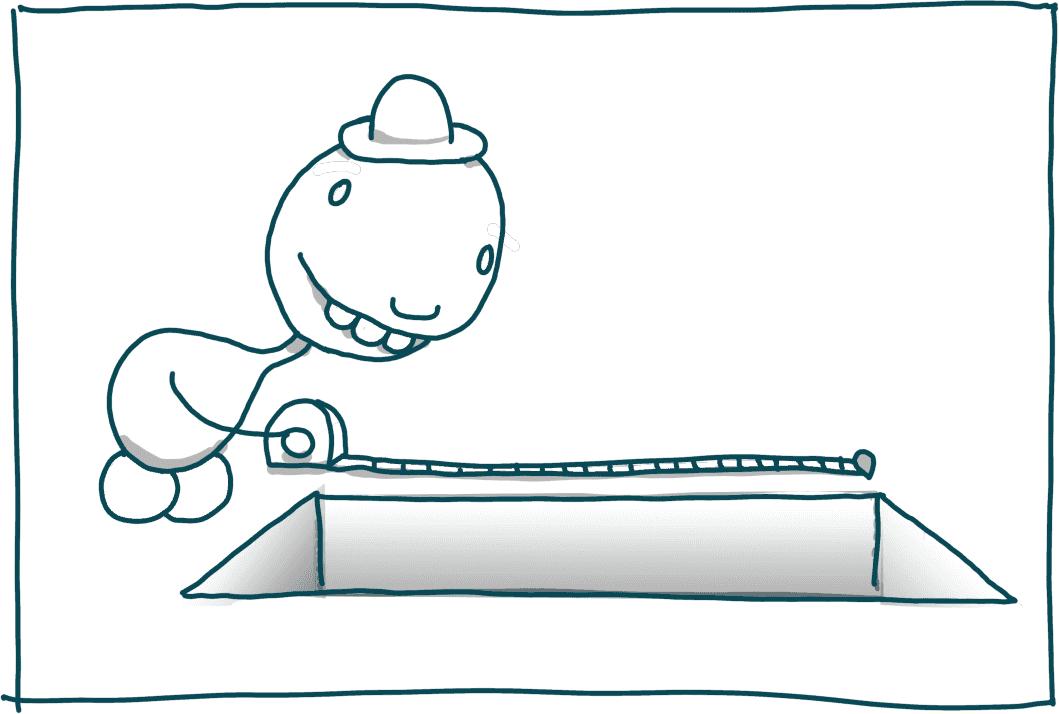
So let’s say you’re making a web page sometime between February 23rd, 1993 and May 25th, 2010. Images are easy! Simply:
- Look at your fixed-width layout
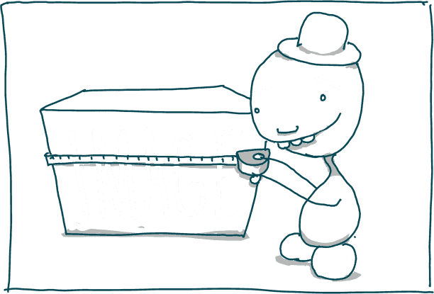
- Measure exactly how many pixels on each and every user’s screen you will invariably need to fill with the image at hand
- Fire up Photoshop
- “Save” your image “for web…” at exactly that size
- Mark it up in an
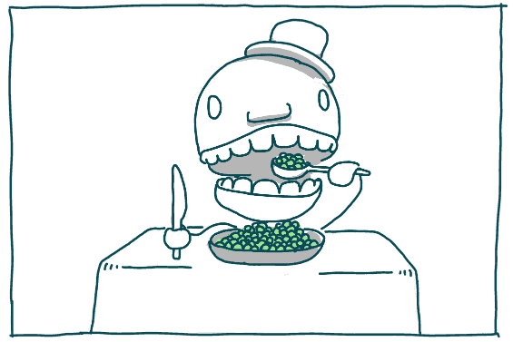
<img>tag - Pour yourself a beer (or maybe crack open a fresh can of peas) to celebrate a job well done.

While a few wise prophets may have occasionally stumbled out of the wilderness, speaking deep truths about the problems inherent in this approach, it has served workaday web designers for twenty years.
But the times, they are a-changing.
Four years ago, Ethan Marcotte published an article; thirteen days later, Steve Jobs announced a phone; suddenly “fluid” and/or “Retina” images were things; subsequently there has been much gnashing of teeth.
Our first instinct when faced with implementing fluid aka retina aka responsive images was to reach for the same tool we use for responsive layouts: media queries!
Browsers can’t know anything about a website that they haven’t loaded yet. But they’re constantly aware of the environment they’re rendering within: the size of the viewport, the resolution of the user’s screen, that sort of thing. The idea of media queries is this: let web developers do specific things for specific environments. If the viewport is wider than a thousand pixels, then show the sidebar to the left. Otherwise, push it below our main content. If the user’s screen is retina, then use a big image. Otherwise, use a smaller one.
Easypeas.
Unfortunately when it comes to responsive images, in many cases, in practice, using media queries to pick a source is “fucking terrible”.
It’s worth a minute to explore why. Media-query-based responsive image source-picking is terrible because while most responsive designers have settled on varying a page’s layout based on one variable (viewport width), when dealing with responsive images,1 we’re really concerned with three variables:
- The rendered size (in CSS pixels) of the image on our layout
- The screen density
- The dimensions of the variously-sized files at our disposal
…which boil down to media queries in non-obvious ways.
Once we know these three things, a solution is trivial. Given a set of sources, pick the smallest one whose dimensions are still greater than rendered size × screen density.
But! Unfortunately! rendered size is a tricky thing to pin down. Web developers can’t know it. Flexible images gonna flex; within a responsive layout an image’s rendered size could be almost anything. And perhaps surprisingly, when the browser starts loading images, it doesn’t know the rendered size yet either — rendered size depends on the page’s CSS, which browsers generally parse long after they have kicked off image loads.
Happily (it seemed), attaching media queries to our source files sidesteps that problem by breaking rendered size in two…
- The viewport dimensions
- How the image will be sized relative to the viewport
…and requiring authors to specify only the viewport dimensions and screen density, after having completed a few many easy difficult calculations involving everything else.
What sort of calculations? Let‘s try an example.

(Note that, while I’ve tried keep this simple, this example’s entire raison d'être is to show you, dear reader, that this media-query-calculating process is tedious and error-prone. If you find yourself quickly convinced feel 100% free to skip to Part 2.)
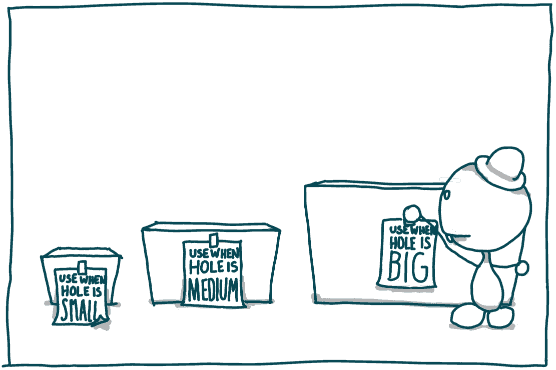
Let’s say you have three versions of an image:
large.jpg(1024 x 768)medium.jpg(640 x 480)small.jpg(320 x 240)
And you want to pick one and load it within in a flexible grid — a grid which starts out single-column but switches over to three-column on larger viewports, like this.
You want to support 1x and 2x device-pixel-ratios.
How to construct your media queries? Let’s start at the top.
large.jpg should only load when absolutely necessary — when both small.jpg and medium.jpg are too small. More precisely, we only want to load large.jpg when:
rendered width × screen density
  > next-smallest-file’s width
In our example layout, rendered width is a simple percentage of viewport width. Thus:
rendered width =
  image’s width relative to viewport ×
  viewport width
The next-smallest file is medium.jpg, so:
next-smallest-file’s width = 640px
Put it all together and we’re left with the following inequality:
image’s width relative to viewport ×
viewport width ×
screen density
  > 640px
Which we can re-arrange in terms of viewport width like so:
viewport width >
  640px ÷
  ( image’s width relative to viewport ×
    screen density )
To construct our media queries, we solve for viewport width, for every possible value of both image’s width relative to viewport and screen density.
image’s width relative to viewport can have one of two values: 100vw before we hit our breakpoint (at 36em), and 33.3vw after it.
As for screen density… well, it could be a lot of things, but we've stated we only need to support device-pixel-ratios of 1x and 2x.
Two possible image’s width relative to viewports × two possible screen densitys = four scenarios we’ll need to consider; let’s look at them one-at-a-time.
1x, before breakpoint:
Because our breakpoint is at 36em, by definition we know that:
viewport width < 36em
Plugging image’s width relative to viewport = 100vw and screen density = 1x into the inequality we devised earlier gives:
viewport width >
  640px ÷ ( 100vw × 1x ) = 640px = 40em
When we combine the two we get something impossible:
36em > viewport width > 40em
So we can throw this scenario out — we’ll never need large.jpg at 1x within the single-column layout.
2x, before breakpoint:
Again:
viewport width < 36em
But now we’re plugging in 2x:
viewport width >
  640px ÷ ( 100vw × 2x ) = 320px = 20em
Combine the two and we get:
36em > viewport width > 20em
So we want to load large.jpg on 2x screens when the viewport is in that range.
1x, after breakpoint
We’re wider than the breakpoint now, so:
viewport width > 36em
And we’re looking at the three-column layout on a 1x screen:
viewport width >
  640px ÷ ( 33.3vw × 1x ) = 1920px = 120em
The viewport is always going to be wider than 36em when it’s wider than 120em so we can throw that 36em bit away. We want to load large.jpg on 1x screens when:
viewport width > 120em
Okay, last one!
2x, after breakpoint:
viewport width > 36em
…and…
viewport width >
  640px ÷ ( 33.3vw × 2x ) = 960px = 60em
…so on 2x screens load large.jpg when:
viewport width > 60em
Let’s put it all together into a media query:
( (min-device-pixel-ratio: 1.5) and (min-width: 20.001em) and (max-width: 35.999em) ) or
( (max-device-pixel-ratio: 1.5) and (min-width: 120.001em) ) or
( (min-device-pixel-ratio: 1.5) and (min-width: 60.001em) )
Working through these same calculations for medium.jpg is left as an exercise to the reader.
What we’re left width, using the original <picture> proposal to mark up our image, is this:
<picture>

  <source src="large.jpg"
          media="( (min-device-pixel-ratio: 1.5) and (min-width: 20.001em) and (max-width: 35.999em) ) or
                 ( (max-device-pixel-ratio: 1.5) and (min-width: 120.001em) ) or
                 ( (min-device-pixel-ratio: 1.5) and (min-width: 60.001em) )" />
  <source src="medium.jpg"
          media="( (max-device-pixel-ratio: 1.5) and (min-width: 20.001em) and (max-width: 35.999em) ) or
                 ( (max-device-pixel-ratio: 1.5) and (min-width: 60.001em) ) or
                 ( (min-device-pixel-ratio: 1.5) and (min-width: 10.001em) )" />
  <source src="small.jpg" />

  <!-- fallback -->
  <img src="small.jpg" alt="A rad wolf" />

</picture>
And a headache!
And a pile of markup that it doesn’t support device-pixel-ratios over two, or under one, and imperfectly supports those in between. If we want to extend our device-pixel-ratio support, the number of scenarios need to consider increases precipitously.
And the worst part about that markup is that if we change any of the underlying variables — the size of our source images, the device resolutions we want to support… or any aspect of of our layout that affects the size of our image — we have to do all of that math again.
Quick, let’s get to Part 2.
Part 2: srcset+ sizes = Awesome!
So maybe media queries aren’t the right tool for the job. What now?
Let’s return to our list of fundamental responsive-image variables, this time thinking about when they vary and who knows what.
| Variable | Known by author when she’s writing the code? | Known by browser when it’s loading the page? |
|---|---|---|
| viewport dimensions | no | yes |
| image size relative to the viewport | yes | no |
| screen density | no | yes |
| source files’ dimensions | yes | no |
Note! Whenever there’s a yes in one column, there’s a no in the other: the author and the browser know different, complimentary things. We’re the keymaster, they’re the gatekeeper; with our powers combined, etc, etc.
How to bridge this gap?
Media queries are like a set of contingency plans. “Look,” we say to the browser, “I don‘t know how big that viewport is going to be, but if it’s this big, use this file. If it’s bigger, use that one. Also use that one if the screen is retina, but not if I’ve switched over to the 3-column layout…” We’re labeling files with a smorgasbord of possibilities, couched in terms of the things the browser will know, but which but we, writing the code, can’t.
And as we’ve seen, in practice, that turns out to a whole lot of work.
So what if we flipped it?
What if instead of supplying the browser with a mess of contingency plans, we simply told it the things that it doesn’t know? Namely: how the image will be sized relative to the viewport, and the dimensions of the source files. We know both of those things. If we could share that knowledge with the browser, wouldn’t it have everything it needed to pick a source?
It would! Indeed, this is what the sizes attribute and w descriptor within srcset in the latest, greatest draft of the <picture> specification are for. Here’s that table again:
| Variable | Known by author when she’s writing the code? | Known by browser when it’s loading the page? |
|---|---|---|
| viewport dimensions | no | yes |
| image size relative to the viewport | yes | sizes! |
| screen density | no | yes |
| source files’ dimensions | yes | srcset! |

Before we dig in, let’s get three things straight.
First and foremost, none of this has been implemented in any browser, yet. Prospects are looking good2 but the spec is still fluid (pun totally intended). So hold off on using any of this. It won’t work now, and it’ll only break later.
Second: once upon a time there was a responsive images proposal called srcset. The brand-new proposal we’re covering relies on an attribute also called srcset. The old srcset and the new srcset both use w descriptors in comma-separated lists of resource URLs, but the old and the new w mean completely different things! Old w was a shorthand form of media query: the width it described was the viewport width. New w describes the width of the file. We’ll go over new w in more detail shortly, but for now, let me just get out one of those Men In Black memory eraser thing-a-majigs and erase everything you ever knew about srcset and w.

All gone? Good.
Third: If you’ve been following along and maybe getting your hopes up about previous iterations of the <picture> spec, know that the new <picture> spec still allows you to switch sources with media queries and attach resolution descriptors to source URLs. If you’re doing art direction, or fixed-size resolution-switching, you absolutely should be using these features. But if you simply want your images to squish and stretch there’s a new tool at your disposal.
Okay. I think I’ve cleaned the slate and set the stage. Let’s tackle our example, this time using srcset and sizes.
To review, we've got three versions of our image…
large.jpg(1024 x 768)medium.jpg(640 x 480)small.jpg(320 x 240)
…and a breakpoint at 36em which switches our grid from one to three columns.
Here’s the markup:
<img src="small.jpg"
     srcset="large.jpg 1024w,
             medium.jpg 640w,
             small.jpg 320w"
     sizes="(min-width: 36em) 33.3vw,
            100vw"
     alt="A rad wolf" />
You may notice that while this markup comes from the “picture” spec, there isn’t a <picture> element in sight. The srcset and sizes attributes will be implemented on <img> too, and for simple, not-art-directed, non-type-switched cases like this, you can and should use a single instance of our old friend, <img> to mark up your responsive image.
Same old <img>, brand new attributes; let’s look at them one-by-one.
src="small.jpg"Oops, this isn’t new at all! It’s our fallback src, same as it ever was, which will load in any browser that doesn’t understand srcset & sizes. Next!
srcset="large.jpg 1024w,
        medium.jpg 640w,
        small.jpg 320w"
This one’s pretty self-explanatory too. srcset takes a comma-separated list of URLs for the available versions of the image; each image’s width is specified using the w descriptor. So if you “Save for Web…” at 1024 × 768, mark that source up in srcset as 1024w. Easy.
You’ll note that we’re only specifying widths. Why not heights, too? The images in our layout are width-constrained; their width is set explicitly by the CSS but their height is not. The vast majority of responsive images in the wild are width-constrained, too, so the spec keeps things simple by dealing only in widths.
Looking into the future, there are a couple of (in my opinion, excellent) reasons why we might like to use h descriptors to describe the files’ heights, too, but — not yet.
And again let me emphasize that while you can attach 1x/2x resolution descriptors to sources in srcset instead of w descriptors, 1x/2x & w do not mix. Don’t use both in the same srcset. Really.
Okay, so that’s srcset & w.
The last bit that the browser needs to pick a source is an idea of how large the image will render within our layout. For that, we have sizes. From our example:
sizes="(min-width: 36em) 33.3vw,
       100vw"
The format here is:
sizes="[media query] [length], [media query] [length] ... etc"We’re pairing media queries with lengths. The browser goes over each media query until it finds one that matches and uses that query’s paired length as the last piece of the source-picking puzzle: the image’s rendered width on or relative to the viewport.
“What’s that?” you say, “Media queries? I thought you said they were terrible?!”
I said that they were a terrible mechanism for picking a source. That’s not what these queries are doing; they’re simply letting the browser in on the breakpoints it’s about to encounter in the page’s CSS a teensy (and crucial!) bit ahead of time. Remember how the various queries in our first example had nothing to do with the page’s only layout breakpoint (which was at 36em)? I mean, 60em, 20em, 10em — they were all over the place! The breakpoints in sizes should mirror your page’s breakpoints exactly. The length after each specifies the image’s width on the layout when that media query evaluates to true.
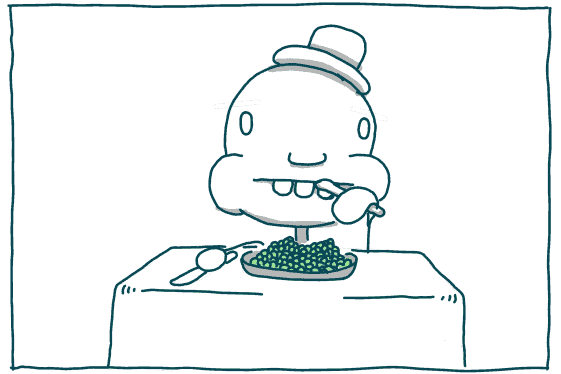
Then the browser, having all of the necessary information, does the same sort of calculating that we slow, lazy, error-prone humans had to do in Part 1. Meanwhile we get to relax and eat peas as God intended.
And! Remember how our media query example only covered 1x & 2x screens? This markup works with any device-pixel-ratio. No more guessing about which resolutions it may or may not be reasonable to support. When a 4.8625x smartwatch comes out in 2016, srcset & sizes have you covered.
Furthermore! This solution gives browsers some wiggle room. A media query attached to a source is either true or false; if true, the browser must load the associated source. sizes and srcset aren’t so rigid; the spec allows browsers to, say, optionally load smaller sources when bandwidth is slow or expensive.
“Well all of that certainly sounds wonderful," you say, nodding slowly, beginning to understand the benefits of a declarative rather than conditional approach. "But wait… what’s a length?”
A length can be all sorts of things! A length can be absolute (e.g. 99px, 16em) or relative (33.3vw, as in our example). You’ll note that, unlike our example, there are lots of layouts which combine both absolute and relative units. That’s where the surprisingly well-supported calc() function comes in. Let’s say we added a 12em sidebar to our 3-column layout. We’d adjust our sizes attribute like so:
sizes="(min-width: 36em) calc(.333 * (100vw - 12em)),
       100vw"
Done!
“Okay, okay,” you say contemplatively, stroking your chin, weary from (but excited by!) this influx of knowledge. “There is, however, one last thing: what’s that dangling 100vw? Did you forget a media query?”
In the language of the spec, a length without a paired media query is a “default length”. If there are no media queries that match, that’ll get used. This means that for, say, a giant, full-width banner image, your markup can be as simple as:
<img src="small.jpg"
     srcset="large.jpg 1024w, medium.jpg 640w, small.jpg 320w"
     sizes="100vw"
     alt="A rad wolf" />
Easy. Peas.

- Or at least stretchy images. ↩
- And you (yes you!) can make them look even better! ↩