Sooper
When I began re-building this thing in 2012 I thought to myself, hey. It's 2012. We have ubiquitous web fonts + I love drawing words = I should make a hand-lettered display typeface. How hard could it be? Then there was a family of hand-lettered typefaces. I named it after my grocery store.
The first face:
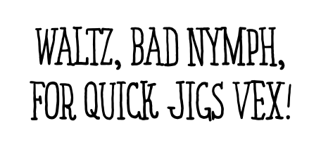
Sooper Serif Thin Condensed
I forget exactly why, now, but at some point it seemed necessary to create a typeface that could appear alongside Sooper Serif Thin Condensed at twice the size, with the same stroke thickness—like I was drawing it with the same pen on the same page twice as large. Thus,
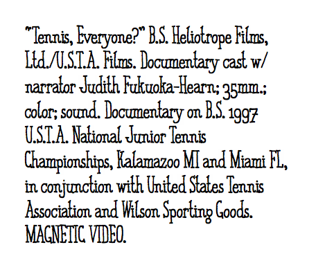
Sooper Serif Thin Condensed 2x
But ultimately when I started designing pages with early versions of these two typefaces it became clear that what I really needed was a big, fat, clear, equally quirky sans that could hold its own when laid on top of photos & dominate a page when set in an <h1> up top. Enter,
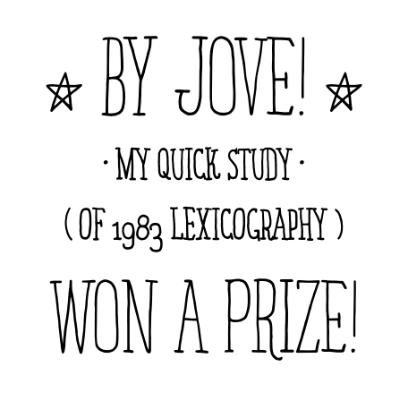
Sooper Sans Thick
Someday I’d love to add to Sooper. I have finished, scanned, & vectorized drawings for italic versions of both of the serifs, and most of the drawing is done on a Sans Condensed Thin. What do the heavier serif weights look like?—it’s an open question. And boy do I ever want to make a layered drop-shadow face to be combined with the Sans Thick.
But... I’d thought creating a fun display font would be a process of buying font-making software and feeding it drawings of letters. Turns out, fonts aren't just sets of glyphs; they're also a ton of rules1 for determining how those glyphs fit together to form words. Drawing one word well is easy; setting up a system that will draw every word well is hard.
I've never felt guiltier about the dozens hundreds of fonts I've pirated.
The Sooper faces are available for purchase in the store.
- Around 1,700 per font, to be exact. This number could have probably been substantially less, had I known what I was doing. I figure I'm like a novice carpenter who uses way too many nails; a novice sewer who employs far to many stitches. And actually I'm actually both of these things too. ↩