Sizes="auto" pretty much requires width and height attributes
Writing, reading, and maintaining sizes attributes is the worst part about authoring responsive images; auto-sizes for lazy-loaded images is a fantastic addition to the platform.
(It is very funny that the Chrome Platform Status entry for sizes=auto currently describes web developers’ collective opinion about the feature as “no signals.” One-in-ten sizes attributes on the web are already using auto, via lazysizes.js! But I digress.)
Auto-sizes just shipped behind the Experimental Web Platform Features flag in Chrome Canary. Which makes this a good time to try to explain the one weird thing about it. In short: in addition to requiring loading=lazy, sizes=auto also basically requires that <img> elements have width and height attributes.
But don’t take my word for it. Here’s a note from Section 4.8.2.2 of the HTML specification, Sizes attributes:
Note: […] it is strongly encouraged to specify dimensions using thewidthandheightattributes or with CSS. Without specified dimensions, the image will likely render with 300x150 dimensions becausesizes="auto"impliescontain-intrinsic-size: 300px 150px
What!? 300×150? It’s true! Here’s an <img> element that uses sizes=auto:
<img
	loading="lazy"
	sizes="auto"
	srcset="
		https://o.img.rodeo/w_1200,h_1200,b_tomato/t_WxH/_.png   1200w,
		https://o.img.rodeo/w_900,h_900,b_goldenrod/t_WxH/_.png   900w,
		https://o.img.rodeo/w_600,h_600,b_forestgreen/t_WxH/_.png 600w,
		https://o.img.rodeo/w_300,h_300,b_dodgerblue/t_WxH/_.png  300w"
	src="https://o.img.rodeo/w_300,h_300,b_forestgreen/t_WxH/_.png"
	alt="An example image that reports its natural dimensions"
>
And here’s what that looks like right now, in Canary, with the Experimental Web Platform Features flag on:

px@2x = 600 device pixels).Before I answer some obvious questions (what is happening, why), let’s tackle the practical: how do I fix it?
What values should I use for height and width?
You should use the height and width, in pixels, of the largest resource that your <img> can serve. If you’re using srcset, that means the dimensions of the largest resource in your srcset:
<img
	loading="lazy"
	sizes="auto"
	width="1200"
	height="1200"
	srcset="
		https://o.img.rodeo/w_1200,h_1200,b_tomato/t_WxH/_.png   1200w,
		https://o.img.rodeo/w_900,h_900,b_goldenrod/t_WxH/_.png   900w,
		https://o.img.rodeo/w_600,h_600,b_forestgreen/t_WxH/_.png 600w,
		https://o.img.rodeo/w_300,h_300,b_dodgerblue/t_WxH/_.png  300w"
	src="https://o.img.rodeo/w_300,h_300,b_dodgerblue/t_WxH/_.png"
	alt="An example image that reports its natural dimensions"
>
(If you’re using Client Hints, you should use the dimensions of the full-size resource, before any server-side downscaling for delivery. Here’s a (Chrome-only) example that uses Client Hints.)
Depending on what else you have going on in your CSS, adding width and height to your HTML might unexpectedly distort your <img>, giving it a garish, fixed height which will pair terribly with its delightfully flexible width. One line of CSS will fix that for you:
img {
	height: auto;
}
<style>
img {
	width: 100%;
	height: auto;
}
</style>

<img
	loading="lazy"
	sizes="auto"
	width="1200"
	height="1200"
	srcset="
		https://o.img.rodeo/w_1200,h_1200,b_tomato/t_WxH/_.png   1200w,
		https://o.img.rodeo/w_900,h_900,b_goldenrod/t_WxH/_.png   900w,
		https://o.img.rodeo/w_600,h_600,b_forestgreen/t_WxH/_.png 600w,
		https://o.img.rodeo/w_300,h_300,b_dodgerblue/t_WxH/_.png  300w"
	src="https://o.img.rodeo/w_300,h_300,b_dodgerblue/t_WxH/_.png"
	alt="An example image that reports its natural dimensions"
>
And here’s a screenshot of what that looks like in Canary with the flag on:

Perhaps you’re already adding height and width to your responsive image HTML and height: auto to your CSS in order to prevent layout shifts. Great! Change nothing!
Ok, so:
What is happening and why?
By default, images on the web are rendered at their natural (aka intrinsic) dimensions. If you stick a 300×300 resource into an <img> and do nothing else, its layout size will be 300×300.
The natural dimensions of responsive images get surprisingly weird, fast, but:
- There are a number of ways that a loaded resource’s natural dimensions can affect the layout dimensions of its
<img>. - The value of
sizes=autoupdates whenever an<img>’s layout dimensions change, possibly triggering a new resource load. - A new resource will have new natural dimensions, which can affect the
<img>’s layout dimensions, which will update thesizes=autovalue, which may trigger a new resource load; the new resource will have new natural dimensions, which …&c.
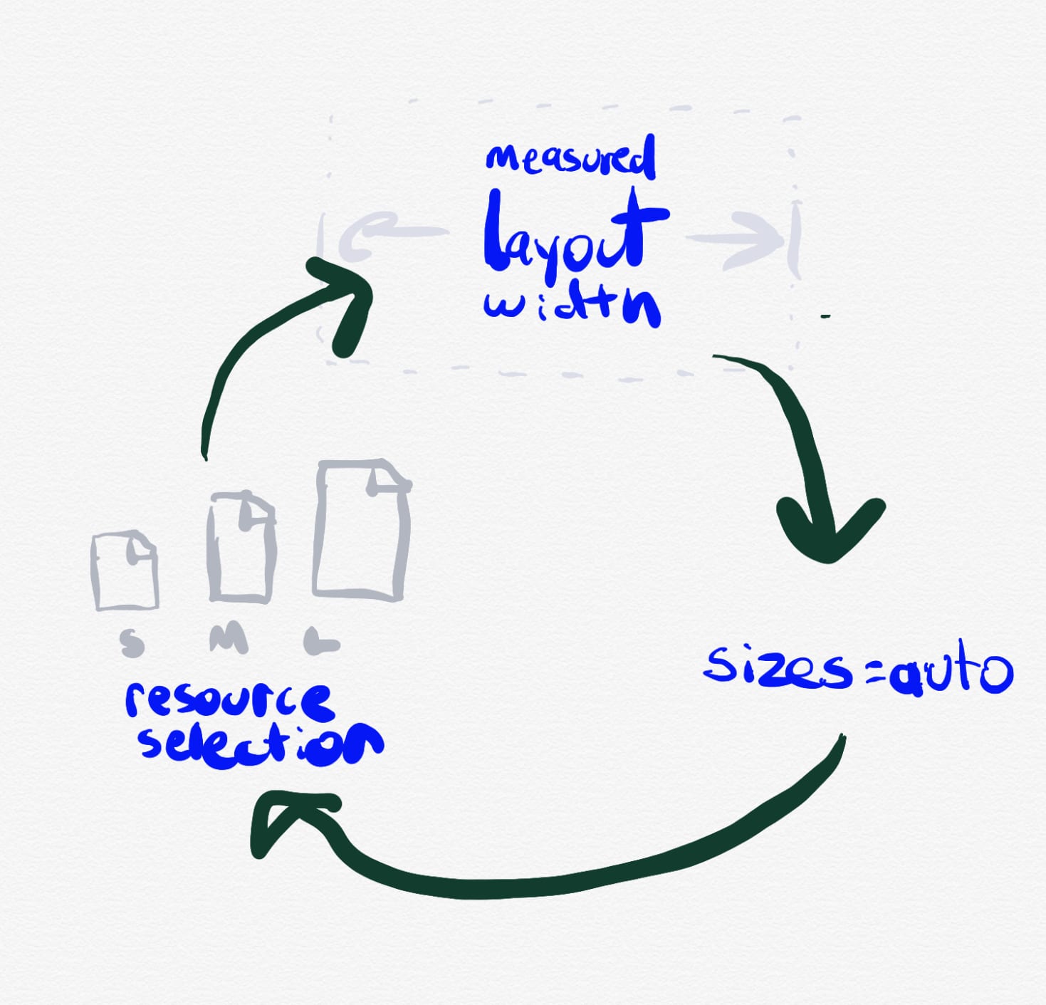
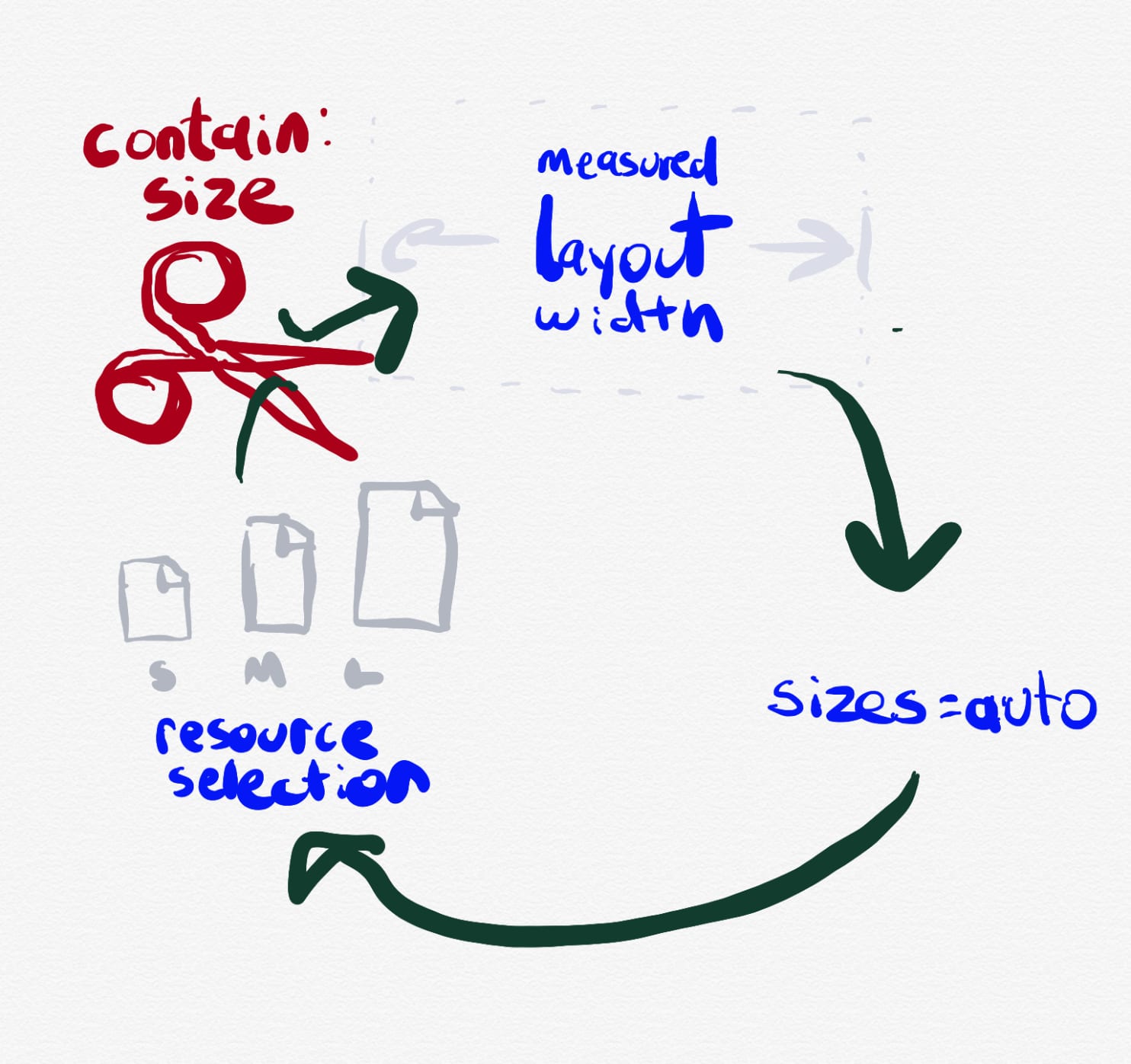
sizes=auto was just: people coming up with corner cases that would load every single resource in a srcset, one-after-the-other, using this mechanism.Simon Pieters, who wrote the auto-sizes spec, made a few valiant and clever attempts to define all of the cases that could possibly trigger cyclical dependencies and work around them in ways that wouldn’t be too weird or noticeable for authors. But when the rubber hit the road and implementers started implementing, those workarounds didn’t hold up. Ultimately, ’twas decided that the only way forward was to make a clean cut: mandate that a loaded resource’s natural dimensions cannot affect its <img>’s layout in any way, ever, when sizes=auto is involved. Luckily, we have a fairly new feature that explicitly does exactly that: size containment.
So now, this is in Chrome Canary’s UA stylesheet:
img:is([sizes="auto" i], [sizes^="auto," i]) {
    contain: size !important;
    contain-intrinsic-size: 300px 150px;
}
That says: are we dealing with an <img> with sizes=auto? Then its natural dimensions are 300×150. NO EXCEPTIONS.
300×150 was chosen because that’s what <video> and <canvas> do; all of these elements use this smallish-but-non-zero default size in order to encourage you to do better.
Finally, we get to the load-bearing weasel-words in the title of this post: “sizes=auto pretty much requires width and height attributes”. width and height are not the only way! I think the pattern that I’m pushing, where you describe the aspect ratio of your content in HTML, and give it a flexible size in CSS – provides a better separation of concerns than any other solution. But the fundamental takeaway is: when you use sizes=auto, your image will be assigned a natural size of 300×150 and a natural aspect ratio of 2:1, and it’s on you to override those dimensions.